Crafting Crystal-Clear Reports: Mastering Business Intelligence Software
In the fast-paced world of data-driven decision-making, the ability to extract actionable insights from raw information is paramount. Business Intelligence (BI) software has become the cornerstone of this process, offering powerful tools to analyze data, identify trends, and ultimately, inform strategic choices. However, the true value of BI lies not just in its analytical capabilities, but in its ability to present complex data in a clear, concise, and easily understandable format. This article delves into the art of creating clean reports within business intelligence software, equipping you with the knowledge and techniques to transform raw data into compelling narratives that drive impact.
The Foundation: Understanding the Importance of Clean Reports
Before diving into the specifics, it’s crucial to grasp why clean reports are so vital. Imagine presenting a cluttered, confusing report to a group of stakeholders. The data, no matter how insightful, will likely be lost in a sea of ambiguity. Clean reports, on the other hand, communicate information effectively, enabling quick comprehension and informed decision-making. They are the building blocks of trust, fostering a shared understanding of the data and its implications. The creation of clean reports is therefore a critical skill for anyone working with business intelligence software.
Poorly designed reports can lead to several detrimental outcomes. They can mislead decision-makers, resulting in flawed strategies and wasted resources. They can also damage credibility, making it difficult to gain buy-in for future initiatives. Conversely, well-crafted reports empower users to make informed decisions, identify opportunities, and mitigate risks. The ability to create clean reports is a competitive advantage.
Key Principles for Designing Effective Reports
Creating clean reports is not simply about aesthetics; it’s about strategic design. Several key principles should guide the process:
- Know Your Audience: Understand their needs, level of technical expertise, and the questions they need answered. Tailor the report’s content, language, and visual elements accordingly.
- Define the Purpose: Clearly state the report’s objective. What specific insights are you trying to convey? This clarity will guide the selection of data and the organization of information.
- Keep it Simple: Avoid overwhelming the audience with too much information. Focus on the most relevant data points and use clear, concise language.
- Use Visuals Effectively: Charts, graphs, and other visual aids can significantly enhance understanding. Choose the right visual for the data you are presenting.
- Maintain Consistency: Use consistent formatting, terminology, and design elements throughout the report. This creates a sense of professionalism and ease of comprehension.
Essential Elements of Clean Reports in Business Intelligence Software
Now, let’s explore the practical elements that contribute to clean reports within business intelligence software. These elements are crucial for transforming raw data into actionable insights.
Data Selection and Formatting
The foundation of any good report is the data itself. Carefully select the data points that are most relevant to your objective. Avoid including extraneous information that could clutter the report. Within your business intelligence software, properly format the data to ensure consistency and readability. This includes using clear labels, appropriate units of measurement, and consistent date formats.
Visualizations: Choosing the Right Charts and Graphs
Visualizations are the heart of effective data communication. Choosing the right chart or graph is crucial for conveying the intended message. Consider these common chart types and their best uses:
- Bar Charts: Ideal for comparing discrete categories or tracking changes over time.
- Line Charts: Best for showing trends over a continuous period.
- Pie Charts: Useful for illustrating proportions of a whole (use sparingly).
- Scatter Plots: Excellent for showing the relationship between two variables.
- Heatmaps: Helpful for visualizing data patterns across multiple categories.
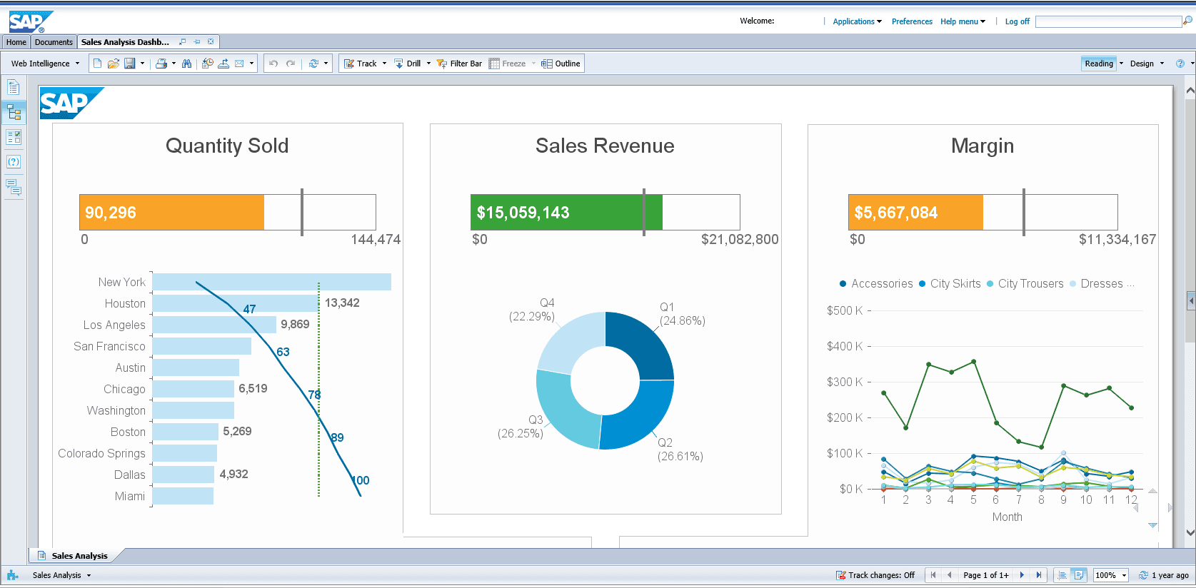
Ensure your visualizations are clean and uncluttered. Avoid unnecessary gridlines, labels, or colors. Use clear titles and axes labels to provide context.
Layout and Design: Creating a User-Friendly Experience
The layout of your report should guide the reader through the information in a logical and intuitive way. Use a clear hierarchy of headings and subheadings to organize the content. Employ white space to create visual breathing room and prevent the report from feeling cluttered. Consider using a consistent color palette and font style to enhance the overall aesthetic. Your business intelligence software should offer tools to customize the layout.
Interactive Elements: Engaging the Reader
Many business intelligence software platforms offer interactive features that can significantly enhance the user experience. These features allow users to drill down into the data, filter information, and explore different perspectives. Interactive elements can make reports more engaging and empower users to explore the data on their own terms. This further contributes to clean reports because it allows users to focus on what they need.
Practical Steps to Create Clean Reports in Business Intelligence Software
Here’s a step-by-step guide to creating clean reports using your business intelligence software:
- Define the Objective: Clearly state the purpose of the report and the specific questions you aim to answer.
- Gather and Prepare Data: Connect to your data sources and select the relevant data points. Clean and transform the data as needed.
- Choose the Right Visualizations: Select charts and graphs that best represent your data and the insights you want to convey.
- Design the Layout: Organize the content in a logical and intuitive way. Use headings, subheadings, and white space to improve readability.
- Add Interactive Elements: Incorporate filters, drill-downs, and other interactive features to enhance user engagement.
- Test and Refine: Review the report with stakeholders and gather feedback. Make adjustments as needed to improve clarity and effectiveness.
Remember that the process of creating clean reports is iterative. You will likely need to refine your reports based on user feedback and evolving business needs. Your business intelligence software provides the tools for that.
Advanced Techniques for Report Optimization
Beyond the basic principles, several advanced techniques can further enhance the effectiveness of your reports:
- Use Calculated Fields: Create new data points from existing data to reveal hidden insights.
- Implement Data Alerts: Set up alerts to notify users when key metrics reach specific thresholds.
- Automate Report Generation: Schedule reports to be generated and delivered automatically.
- Incorporate Storytelling: Weave a narrative around your data to make it more engaging and memorable.
These techniques can elevate your reports from simple data presentations to powerful tools for driving business decisions. Using your business intelligence software effectively is key.
Specific Considerations for Different BI Software
The specific features and functionalities for report creation vary depending on the business intelligence software you are using. Popular platforms like Tableau, Power BI, and Looker offer a wide range of tools and capabilities. Familiarize yourself with the specific features of your chosen platform to maximize your reporting efficiency. Understanding your business intelligence software is vital.
For example, Tableau excels at data visualization and offers a drag-and-drop interface for creating interactive dashboards. Power BI is known for its seamless integration with Microsoft products and its ability to handle large datasets. Looker emphasizes data modeling and governance, providing robust tools for managing data accuracy and consistency. Each business intelligence software has its strengths.
Conclusion: The Power of Clear Communication
In conclusion, the ability to create clean reports is a critical skill for anyone working with business intelligence software. By following the principles outlined in this article, you can transform raw data into clear, concise, and actionable insights. This is a process of continuous improvement. Effective reports are essential for driving informed decision-making, fostering collaboration, and ultimately, achieving business success. Remember to always prioritize clarity, accuracy, and the needs of your audience. The power of clear communication, delivered through well-designed reports, is undeniable.
Mastering the art of creating clean reports is a journey. It requires a combination of technical skills, design principles, and a deep understanding of your data and your audience. By investing in this skill, you can unlock the full potential of your business intelligence software and become a more effective data communicator. This will lead to better outcomes. You can also [See also: Building Effective Data Dashboards].

